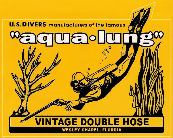


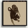
The top one was used in 58 on a few USD advertisements.....I took that design and simply put my company name and location on it. I did not try to screw up the design by adding a lot of poorly drawn nonsense on it as you will see in other versions of it. Those modifications really detract from the simplistic beauty of the original in my opinion. Mine uses only the elements of the original design and is meant to be an homage to the first "aqua-lung" divers and how much their history means to us today.kimJackson1 wrote:Bryan,
I think both are great and very
Have you given any though to making the top one a sticker?
Regards,

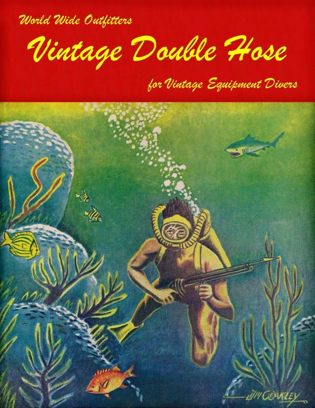
His head is big enough without thinking this is all about him tooHerman wrote:Nice Bryan.....does anyone else think that looks like Rob in the second one??
There is another version of the sticker that someone else made. It had several modifications/additions to the original. As can clearly be seen in the pictures above my new logo is a direct copy of the ORIGINALthat was put out by US Divers. Mine is not a copy of any other designs. If US Divers does not want me to use their artwork to advertise then I'm sure they will let me know.Drado wrote: Quick question regarding the 1st logo: Isn't Rob experiencing some difficulty with the diorama shirts because (If I inferred correctly) of someone laying claim to the design? Would this present a problem based on "prior art?"


simonbeans wrote:

That could not be Rob… That guy is not doing a frog-kick.Herman wrote:Nice Bryan.....does anyone else think that looks like Rob in the second one??
Return to “General Discussions”
Users browsing this forum: No registered users and 12 guests