Page 4 of 6
Posted: Wed May 14, 2008 12:37 pm
by boogerdave
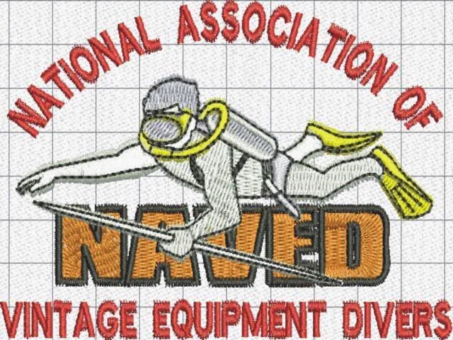
I posted a stitch out graphic in the gallery. Once again, this is not the finished product but it does get a better idea of what it would look like. I actually did a stitch out and went to take a picture . . . the camera batteries died as I hit the button. I'll have a picture by the end of the day. Still looking for comments on it though. Dump the guy?? Add something else? Lettering only?? Let me know what you think. -Dave
Posted: Wed May 14, 2008 7:44 pm
by JES
Here's Dave's image:
Posted: Wed May 14, 2008 7:53 pm
by kgehring
I like it!
Posted: Wed May 14, 2008 8:39 pm
by JES
I like it better as well.
What about a different color for the word "NAVED" and just a little more color on the diver (i.e., the shorts, etc.)?

Posted: Wed May 14, 2008 8:51 pm
by Bryan
I think its coming along nicely.
Posted: Wed May 14, 2008 10:38 pm
by boogerdave
I'll do a couple of changes and post again friday. I have sewing class tomorrow . . . (No comments from the peanut gallery . . . .)
Posted: Thu May 15, 2008 2:01 am
by duckbill
I think it looks pretty good.
My two cents-
The separate colored rear white arm and leg look awkward. Use the shadowing for the rear arm and leg and make the fore arm and leg (and even the body) white (the opposite of what you have now). If that also looks awkward, then make the body and limbs all the same shade.
Maybe the hose could arch up more around the ear in a "S" shape. The way you have it now does imply some forward motion, so.....maybe keep it that way. Just thinking out loud.
Posted: Fri May 16, 2008 7:10 am
by JES
Dave we're looking forward to seeing the changes to your design today. Do us proud!

Posted: Fri May 16, 2008 4:26 pm
by boogerdave
Ok . . I added more color to the diver, got rid of the spear and went with the yellow for the lettering. Color changes from here are easy so no problem there. I had a bit of a time trying to redo the hoses on the clipart image of the diver so I gave it up for now. Comments . . .??
Posted: Fri May 16, 2008 6:41 pm
by JES
Dave,
Your photo didn't get uploaded to your gallery.
Please try reloading it again and I'll post it for you in this thread.
Posted: Sat May 17, 2008 8:43 am
by boogerdave
Grrrrr . . . . I hate dial up service . . .
The picture is there now (according to what I got) but I couldnt get it to create a thumbnail. Dont know why. Give it another try. -Dave
Posted: Sat May 17, 2008 9:07 am
by JES
NAVED Logo V2:

Posted: Sat May 17, 2008 2:20 pm
by 1969ivan1
Looks Nice...
Posted: Sat May 17, 2008 2:26 pm
by capn_tucker
Very cool..
Posted: Sun May 18, 2008 1:39 am
by duckbill
Outstanding!
I'd wear it, spear or no spear!
Personally, I like the spear, but maybe it did distract from the NAVED lettering some.